Realto
2026 | Realto Properties
Services
- Strategy
- Brand identity
- Website
- Stationery
- Billboards
Sector
Leisure & Tourism / Accommodation / Real Estate
Setting the foundation
Thoughtful places to live, and a different way to feel at home.
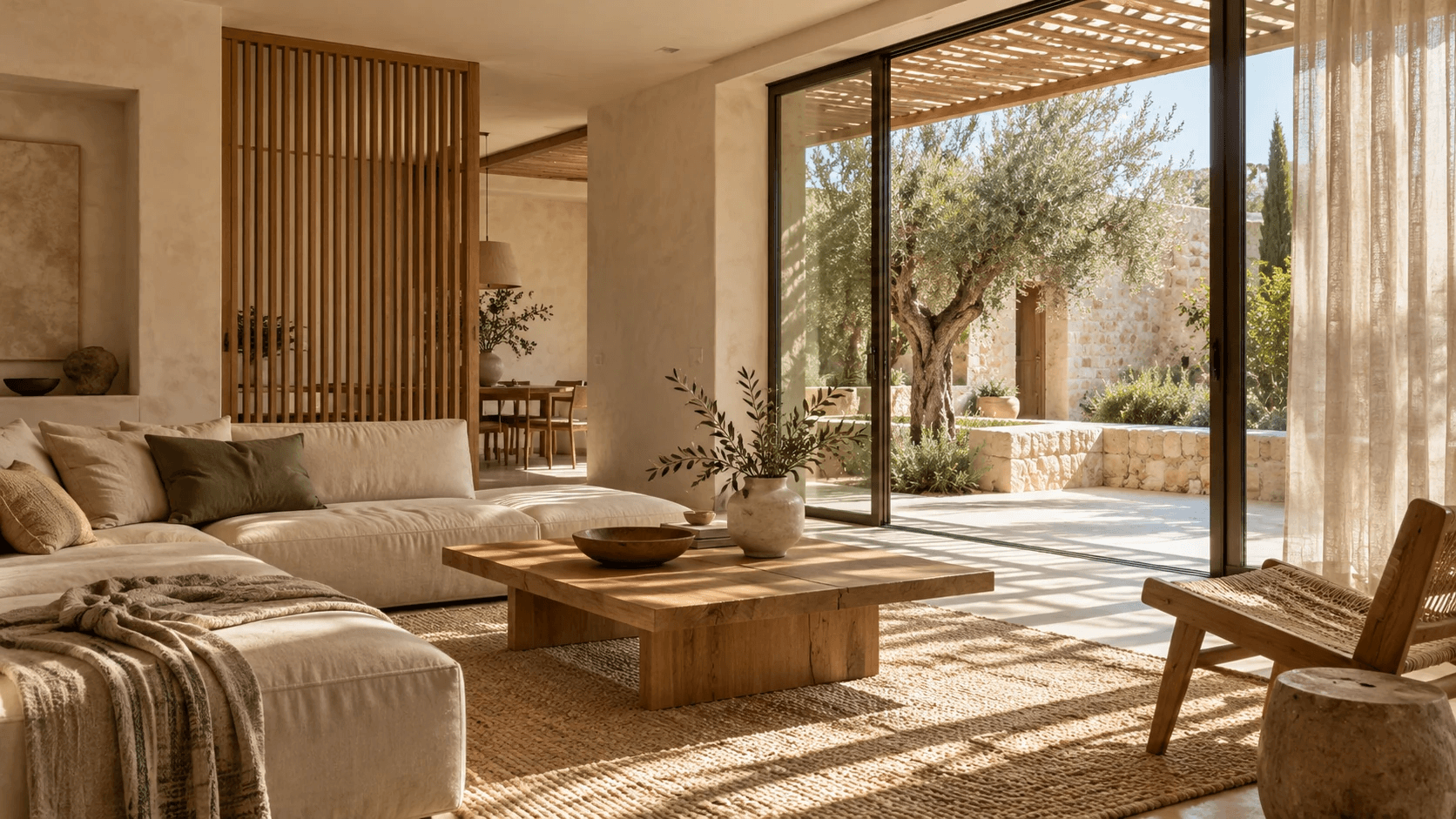
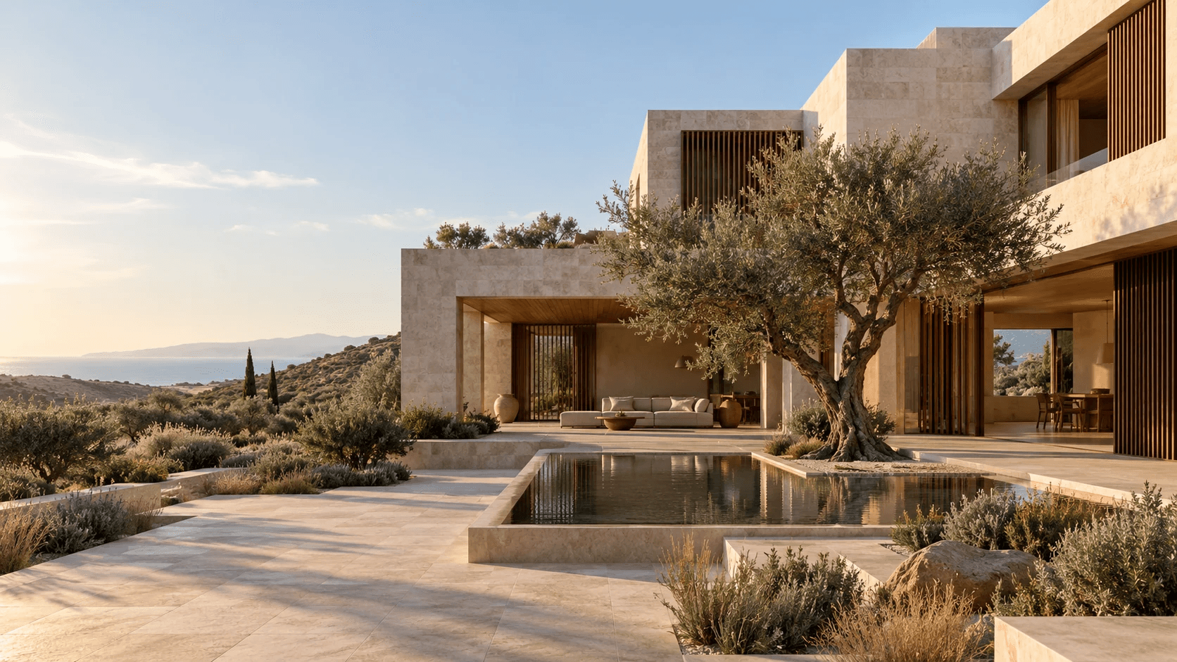
Realto builds homes across Cyprus and Greece for people who want more than square metres. Every project, from a village villa in Souni to a mountain residence, is designed around one idea the founder calls Japancy: Japanese calm, Cypriot soul.
The brief was clear. Realto could not look like an estate agency, a resort or a tech startup. It needed a brand as quiet and deliberate as the homes themselves. Less noise. More life.


Drawing the mark
Rooted in the Island
We started with a leaf, a nod to the olive groves and carob trees that shape the Cypriot landscape. A second leaf turns to meet it, two sides of every home coming together.
The result is a mark that reads as nature, connection and belonging all at once. Paired with a refined serif wordmark, it feels at home on a stone wall as much as on a screen.
Materials and details
Made to Be Touched
The palette comes straight from the island. Limewash and carob lead, with warm stone, a soft sky blue and touches of olive and plum.
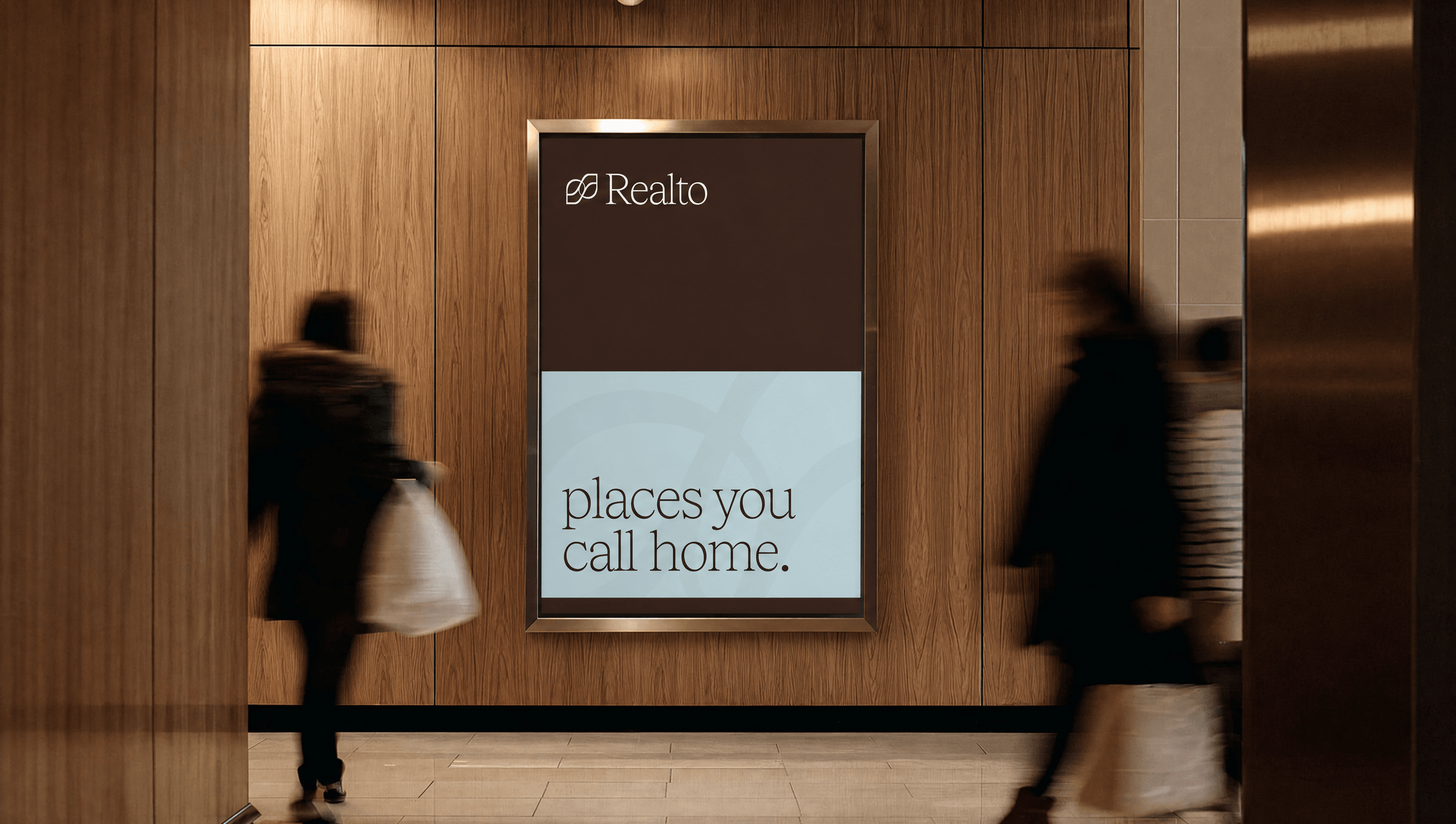
We carried the system into the physical world: debossed stationery, business cards, engraved stone, totes and billboards.
Testimonial
“Muflon understood what Realto needed before we did. They took an idea we could only describe as a feeling and turned it into a brand that is quiet, confident and unmistakably ours. Every detail, from the mark to the stationery, feels as considered as the homes we build.”